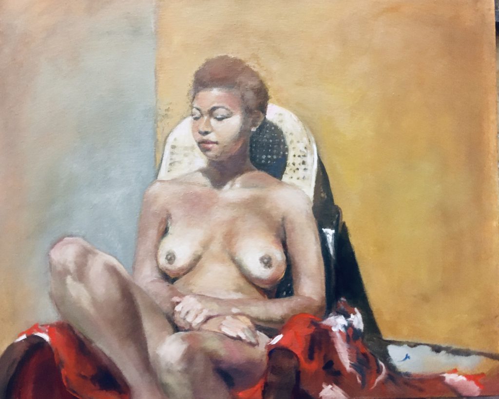
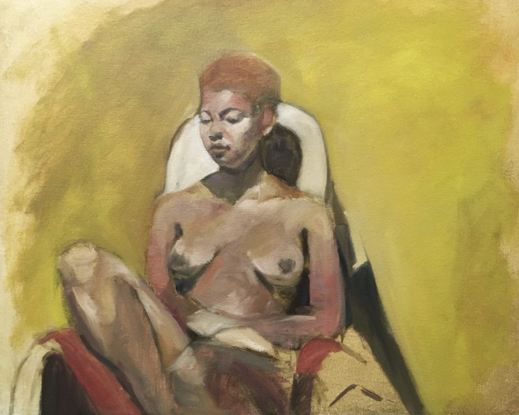
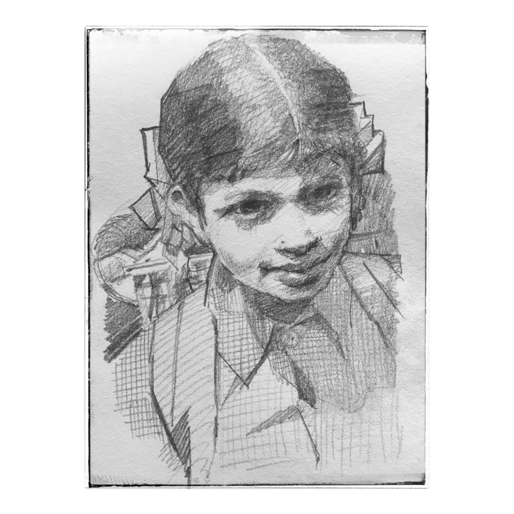
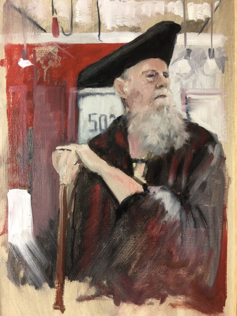
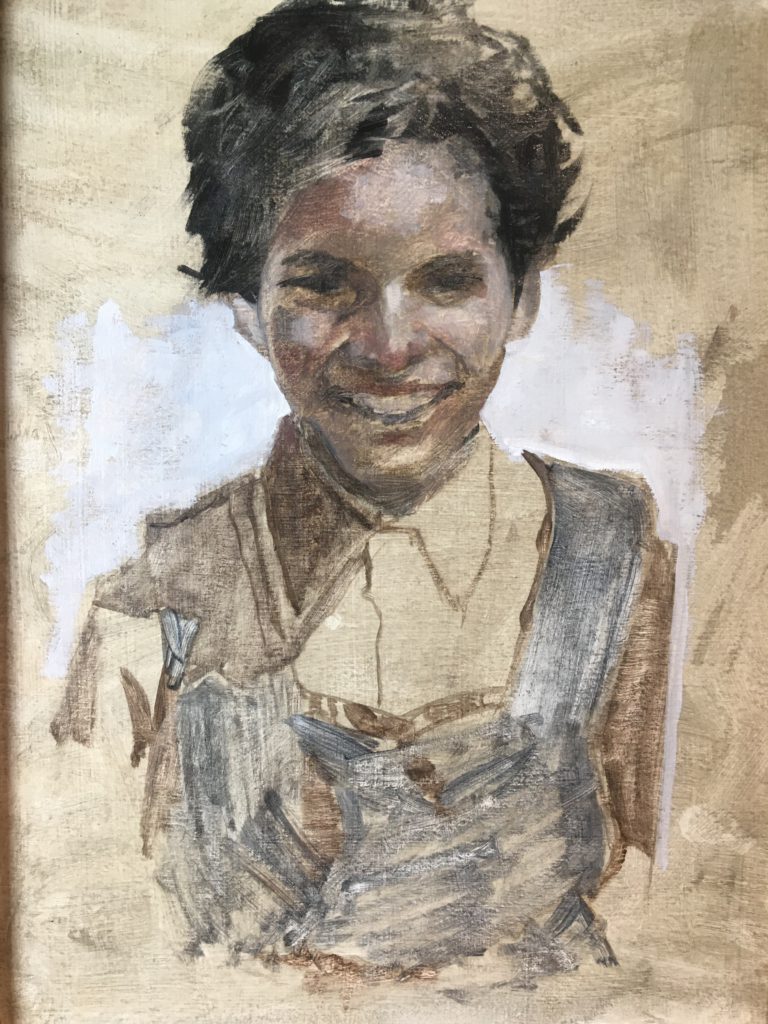
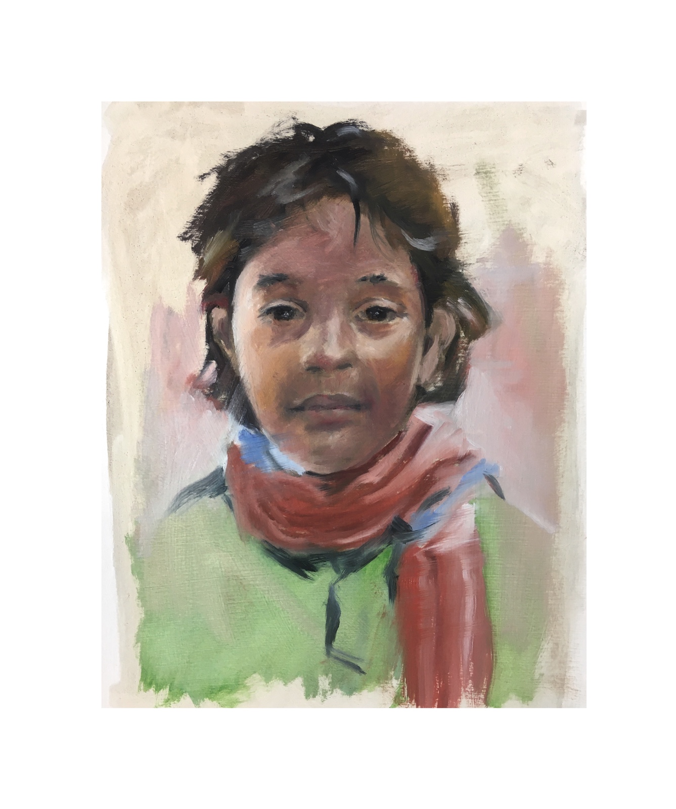
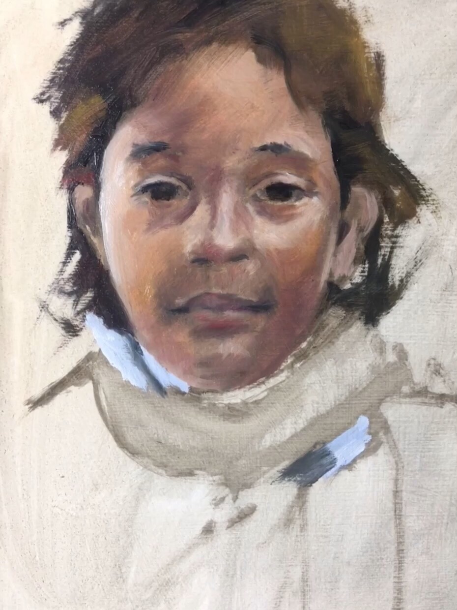
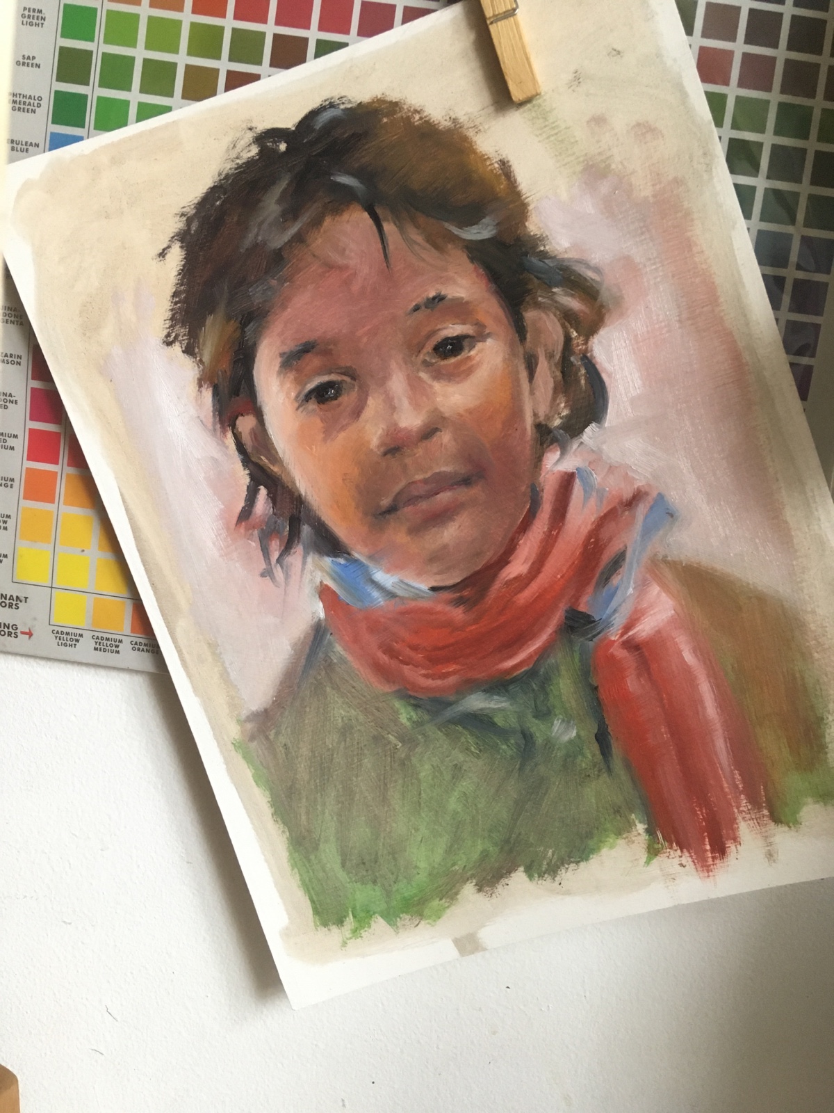
This is the other drawing from Wednesday, January 6, 2021. I never got around to share the first drawing because it had been interrupted by the US Capitol Riot–I posted my second drawing: a police officer in riot uniform.
Today, I found myself looking at this, thinking that I will always remember January 6th when I look at this particular drawing. I have been working to better capture values of what I see by making use of all the shades of gray at my disposal: 10B to 10H.
Every so often, when I paint or draw, there are occasional A-ha moments. These moments come in small waves, in complete silence, but with unusual confidence, letting me know that I am progressing. And, I suppose that’s how Democracy is built on as well.
Drawing Pencil Recommendation
Hi-uni Graphite Pencil Set, 22 Pieces – These are main Graphite Pencils. The Hi-Uni Graphite Pencil Set includes 22 different hardness grades, one each of 10H, 9H, 8H, 7H, 6H, 5H, 4H, 3H, 2H, H, F, HB, B, 2B, 3B, 4B, 5B, 6B, 7B, 8B, 9B, and 10B, in a nice aluminum case.
All the news about Georgia is interesting, but I find it amusing that whenever I hear the news about Georgia, I can almost hear the song, Georgia on my mind, by Ray Charles. Do you know it? If not, I embedded a version of the youtube video for your viewing and listening pleasure at the end of this article.
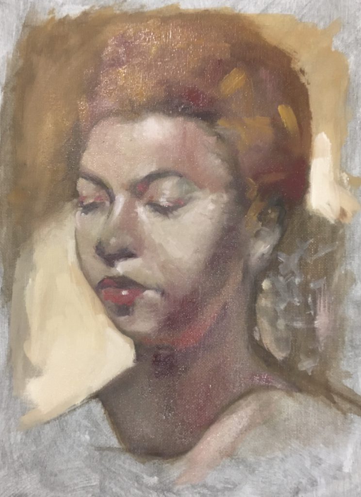
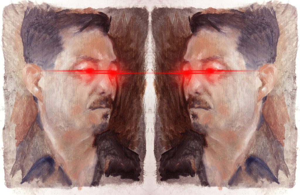
I have been experimenting with a number of sketches for my next project, and I have incorporated some ideas with this portrait, mixing some of my early year painting style with contemporary realism ideas. They don’t really go together just yet, but I will keep at it.
I have heard so much news about Georgia this week in the States because of Georgia’s Senate race. There has been much speculation about what could happen based on who wins the race.
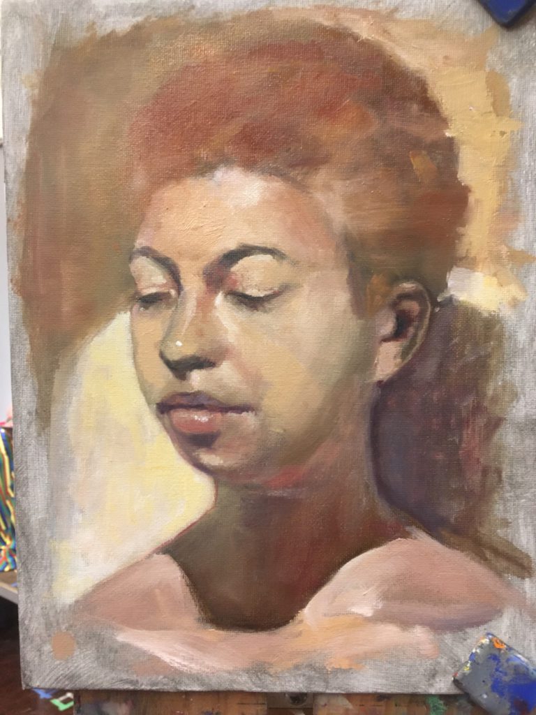
Between all the news about Georgia’s Senate race, I was drawing a portrait, which I appropriately named it: Georgia. It felt like the right name for today’s work after all the talk about what’s happening in Georgia.
Related Post:
A Boring Portrait – Check out how I turned a good drawing into a boring one.
Materials Used:
Blackwing Pencils – Used by famous artists since first introduced. These pencils drive nicely.
Finally, here is Ray Charles, singing Georgia on my mind – Live 1976
This is my first 2021 portrait–executed on 4 January 2021. This is the 25th of my #100humanchallenge I started at the end of 2020.
I began to draw this painting after spending an hour or so reading and listening to news. I wasn’t entirely sure how far I wanted to go with this drawing. After all, these portraits has been a side project, allowing myself to tune the way I see the world.
Meanwhile, according to news, the world is having a real tough time dealing with Covid-19:
In the States, there has been 352K of deaths from 20.8M cases.
More people are traveling, despite all the cautionary recommendation. I suppose that’s how us Americans have believed from the very beginning: give me freedom or give me death.
Of course, I am not here to judge what’s right or wrong, but merely recording what I am listening to.
Let me finish my thought on this pencil portrait…
So I have enjoyed using pencil to record what I see. My method of recording mostly has been quick, expressing what I see with line drawings without much shading. I was never a fan of sitting around and drawing for hours with pencils, but I have been pushing myself in the recent months–when I sit down to do these portraits for an hour or two, that’s definitely way beyond how much I am willing to invest on pencil works.
The portrait felt pretty boring to me, but every drawing or failed work could be a stepping stone to a masterpiece!
2020 has been unpredictable. The first half of the year was especially strange. Experiencing the complete lock down of New York City, and all the uncertainty of the near future made everything so strange.
Escaping from all that uncertainty–to my surprise–created unexpected opportunities, connecting me with artists from New York City and beyond.
The selected images on this post showcases some of the works that I created from January to June. The following are the excerpts from my Instagram posts:
January 3, 2020: This is the final product that transitioned me from 2019 to 2020. I finished it around 11:30 AM today.
January 26, 2020: Oil on Canvas – 30” x 24” – Daedalus & His Wings — This is the final view of my latest project. Sending huge thanks to Donato for the inspiring pose!
February 17, 2020: Oil on Canvas—27” x 48” inches: This is the final product. This project—which was executed from Jan 27 through Feb 14—brought lots of good personal memories. Besides my own stories, here are 5 stories that caught my attention in the course of 3 weeks: (1) Kobe Bryant and daughter Gianna died in helicopter crash, (2) The Coronavirus scare accelerated as new cases of the virus found in U.S. patients–noticeable number of people in New York City has been wearing face masks, (3) On 5 Feb 2020, Trump was acquitted on 2 Articles of Impeachment, (4) Pentagon diverted $3.8 Billion to pay for a wall along the U.S. border with Mexico, (5) Bumble Bees are disappearing due to climate change.
February 28, 2020: I am about to check out “Countryside, The Future” exhibition at #Guggenheim. Oh. In case you are wondering, I safeguarded my latest portrait—still work in progress—from coronavirus. Swipe to see how the painting developed today: I worked on the face and the hands, btw. PS: Seriously speaking, stay safe out there and remember to wash your hands often!
March 10, 2020: Painting slow and painting fast—After spending 2 weeks on my last painting—I need another day or so to finish that painting—I returned to paint an #allaprima to loosen things up a bit. I find it helpful to paint a long and short paintings concurrently and also drawing constantly—See my post yesterday for samples: As some of you might know from looking at my drawings, I am a big fan of quick drawings, especially line drawings.
April 11, 2020: Oil on Linen – This is my first finished portrait of my wife, one of the dedicated New York City Teachers, who has been teaching our New York City students during the COVID-19 pandemic.
As some of you know, the NYC department of education unleashed distance learning to 1.1 Million Students, while continuing to provide FREE ‘Grab and Go Meals’ to all those in need. My hat goes off to teachers, the department of education, and supporting organizations.
This portrait was executed in 3 phases on the following days: April 5th, 6th, and 8th.
May 13, 2020: Oil on Linen, 10” x 8”, title: Raising Covid-19 — Here are the latest stats on Covid-19 (World) 4.3 Million+ confirmed Covid-19 cases, 292K deaths. (United States) 83K deaths—28% of the confirmed deaths in the world thus far come from the United States. I suspect comparing these stats among countries don’t mean much since the majority of the countries are not counting—or testing for that matter—the same way we are counting here in the U.S. No worries, though—We are still # 1.
May 28, 2020: As we welcome the return of traders to the floor of the NYSE this week, here is a painting to remember this epic week—a life portrait of my friend @dougholtstudios, a fellow artist here in New York City.
June 12, 2020: We have welcomed the reopening of New York City after so many weeks of being quarantined. Some states that had opened up first have been reporting increased Covid-19 cases, but that is no surprise. One thing is for sure: reopening of our economy will require relentless forward movement.
Here are the latest stats on Covid-19 (World) 7.27Million+ confirmed Covid-19 cases, 413K deaths. (United States) 116Kdeaths—28% of the confirmed deaths in the world thus far come from the United States.
I am writing down how to ‘paint safely using oil colors’ to invite new artists to try using oil colors instead of other alternatives in the market. There is much to learn, so I will publish related content in several, bite-size, posts.
Painting with oil colors comes with a heavy cost to some artists. Some oil colors contain toxic chemicals—such mercury, cadmiums, cobalt, lead–and oil color mediums to change oil colors or to clean your brushes can be extremely harmful. Despite the dangers of these chemicals—let me assure you—that oil painting is a safe sport.
The absolute Eco-friendly Oil Painting option is to limit your colors to use natural earth based colors, and eliminate the use of solvents. I hope I can lead up to that in the coming series, so stay tuned!
The dangers from the toxic materials weren’t well known until recent decades, so it’s not surprising that some of the best known ‘dead’ artists had been careless: Carravaggio often used his painting palette as a plate, Van Gogh apparently drank paint thinners, and many artists painted with bare hands, exposing them to chemical poisoning. Perhaps it was the result of chemical poisoning that made Carravaggio go off killing people, and changed how Van Gogh see colors with higher shades of yellow.
So why use oil colors? Well, because many oil colors are “organic” and safer than newer, heavily advertised artist painting materials. What do you think will be more dangerous: eating oil colors made from earthly materials vs. ingesting Acrylic paint? But the major reason to paint with oil colors is the quality of the end product that is more vibrant and closer to living things.
Here are 3 main practices that I have experimented to paint safely:
Make use of non-toxic colors
Stop or Limit the use of paint thinners
Make use of Acrylic Paints for underpainting
I will discuss above practices in upcoming posts. Let me end today’s posts by inviting you to read a post from August 2020 and recommending you additional two colors to start your oil painting journey. Once you have read my two posts, you will be armed with four colors for portrait painting: Ivory Black, Red*, Yellow Ochre, and Titanium White–This is a safer alternative to Zorn Palette, named after Anders Zorn.
RED
*Anders Zorn used Vermillion (PR106), which is an opaque reddish orange pigment that is super toxic if ingested. Many artists now use Cadmium Reds, which is also toxic. Here are some additional options that I have experimented.
Bright Red (PR254-Pyrrole Red; Lightfastness: Excellent) – Excellence choice from organic, red pigment options.
Scarlet Lake (PR255-Coral Red; Lightfastness: Excellent) – yellowish red pigment – Not completely safe, but better than Vermillion.
Winsor Red (PR255-Coral Red, PR254-Pyrrole Red; Lightfastness: Very Good) – PR255 as a yellowish red pigment. PR254-Pyrrole Red, used originally developed to replace carmine and naphthol reds, another possible replacement color for Vermillion. Again, Winsor Red is also not completely safe, but better than Vermillion.
Yellow
Yellow Ochre (PY42-Yellow Ochre; Lightfastness: Excellent) – One of the oldest and safest pigment of all times, allegedly enjoyed even by cavemen. Some companies also use PY43, but I prefer Michael Harding.
White
Titanium White without Zinc – (Williamsburg: PW6-Titanium White) – This pigment is considered completely non-toxic. Titanium became the most commonly used pigment since 1940s. Be mindful that this Winsor Newton Titanium White contains Zinc White, which has been known to be problematic in the recent years.
Black
Ivory Black (PBk9-Ivory Black: Lightfastness: Excellent) – Ivory Black is a misleading name since it’s no longer made using Ivory. The ones that are in the market is made from Animal Bones, and is referred to as Bone Black.
Eco-Friendly Oil Painting Series
PART 1 – Know the dangers of using solvents and chemicals
PART II – Recommended Colors for Portraits Painting
In all my years of studying art, I never paid much attention to Anthony Van Dyke. For years, I thought he was a cousin or a brother of Jan van Eyke who died in 1441. Anthony van Dyke was born on 22 March 1599 and he wasn’t Jan van Eyke’s cousin. I grew a whole new appreciation for Anthony’s works when I visited The Frick Collection, located in New York City, in 2019.
Artists will begin to see more than what we used to see after some months of training to become a draftsman. Perhaps, that’s what had happened to me on that fateful day. I remember that it was early Spring. It must have been late March or early April because I remember that people were still wearing winter clothes and the museum was a safe escape from the cold. I had gone to the museum to see a special painting exhibition of Giovanni Battista Moroni.
There are many great paintings in museums around the world, and there are a number of famous paintings because of their historical value and all, but then there are some paintings that stand out to each artist. I have grown to admire a few artists and their paintings. And, I thought I would share them with you starting with this story.
New York City hosts a few paintings by Anthony Van Dyke. Here are 3 of my favorites. Click on the links to read more about them.
Everybody has been disrupted by Pandemic. #100HumanChallege is something that I started–to motivate myself to draw and paint with all the social distancing measures, and to keep track of major events that are related to each create day–but everyone is welcome to participate. Follow the following simple guidelines.
Draw or paint a human face or figure
Post your work on Instagram, Twitter, Facebook, and any other social media channel
Tag your posts using #100HumanChallenge
Optional: Include a sentence or two of one major (or minor) current news from your part of the world (e.g. Covid-19 case counts)
Why #100HumanChallenge
The pandemic has separated all of us, but it also has brought people together in unprecedented ways: we have been connected virtually like no other time in human history thanks to the advent of incredible communication technology.
Artists have paved the future throughout human history with their visions of the future. As artists, we have a unique opportunity to share our world as we fight and emerge out of this pandemic. To take a part of that vision, I am recording my thoughts and progress one portrait, one figure at a time. Join me or check it out: #100humanchallenge
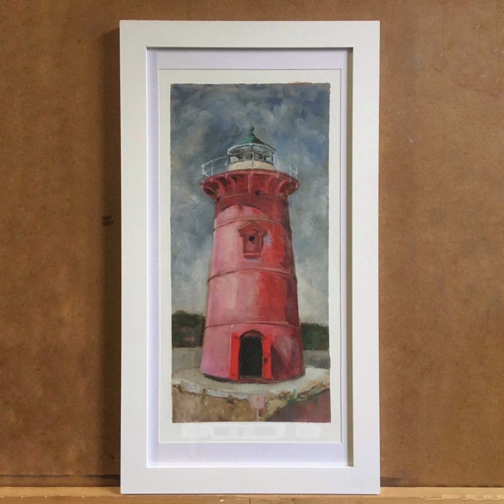
At the near tip of Manhattan, under the George Washington Bridge, stands a famous lighthouse. It’s the Little Red Lighthouse, also known as Jeffrey’s Hook Light. It has stood there over 100 years.
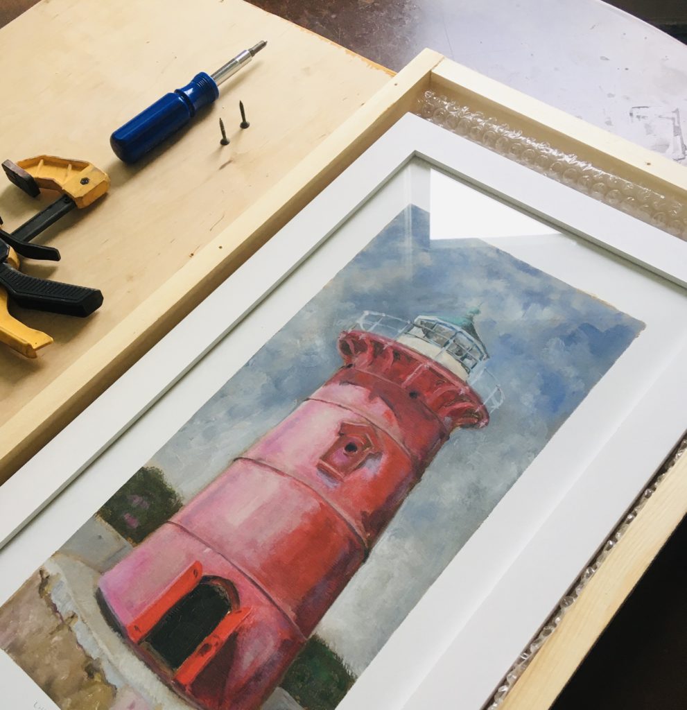
I was pleasantly surprised when I accidentally discovered it over 10 years ago, hiding under the George Washington Bridge. In the years that followed, the lighthouse would become one of my favorite structures to draw and paint. Mind you, as a figurative painter, I am usually painting people, but this lighthouse has been one of the exceptions. This painting of the Little Red Lighthouse was painted from life on a beautiful sunny day.
While painting it, many visitors wished to have a copy of it, so I dedicated time to research the best possible way to reproduce the painting. Both limited edition and open edition prints are produced from New York City. When you purchase these edition prints, you are also supporting New York Businesses.
As the world fight the Covid-19 outbreak, I entered my Little Red Lighthouse Painting to the Northern Manhattan Art Alliance 2020 Arts Stroll Exhibition, as a way to ignite “hope” and a “way forward” as I reflect on myself, my past, my life, my family, current situation, and where I am in the world. You can download the exhibition catalog using the link below.
In the spirit of educating a new generation of figurative painters, I will post a few easy to follow instructional content. If you are serious about learning, you should visit the nearest Ateliers, which have been springing up all over the world. In my mind, there should be more of these places.
If you are starting to paint human portraits or figure, you can purchase almost unreasonable number of oil paint. Well, you can, but I suggest starting with 2 basic colors: Ivory Black and Titanium White. With these two basic colors, your focus should be experimenting with the oil colors, thinner, and linseed oil. All these materials are listed below for your convenience.
Note: Instead of the Ivory Black, you can also use earth colors such as Burnt Umber or Burnt Sienna. The following is a sample underpainting.
Demo
One you have the basic material and a few brushes, you want to try drawing a face. Here is a quick oil painting demo on my Instagram Page. If you have questions, feel free to post your question as a comment.
Material Recommendation
Titanium White without Zinc – (Williamsburg: PW6-Titanium White) – This pigment is considered completely non-toxic. Titanium became the most commonly used pigment since 1940s. Be mindful that this Winsor Newton Titanium White contains Zinc White, which has been known to be problematic in the recent years.
Ivory Black (PBk9-Ivory Black: Lightfastness: Excellent) – Ivory Black is a misleading name since it’s no longer made using Ivory. The ones that are in the market is made from Animal Bones, and is referred to as Bone Black.
Linseed Oil – Oil Holland Bleached Linseed oil. From all the linseed oil types I have used, I like this one the best.
Gamsol -What is Gamsol? It’s almost an orderless solvent that replaced its hazardous cousins such as Turpentine. When starting to paint, you can use Gamsol to thin the oil paint, similar to how you would use water to think watercolors. This solvent, while it doesn’t smell as bad and advertised as being safer, you should take all the safety measures when using Gamsol.